
Showing posts with label design. Show all posts
Showing posts with label design. Show all posts
Thursday, November 3, 2011


Wednesday, November 2, 2011
Chinese Rubberband TYPO


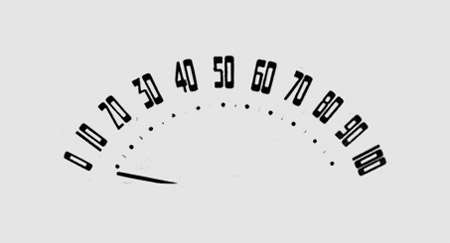
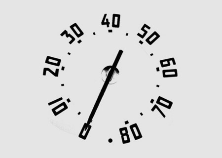
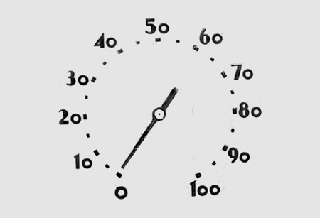
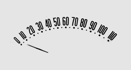
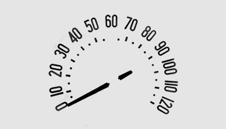
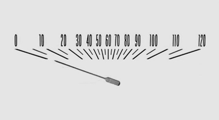
The Chinese Rubberband typo was designed by Hong Kong designer Che ManChing.
Here is what he had to say about this project:
“Years passed, Hong Kong experienced different storms. However, Hong Kong is still a prosperous economic country in the world. People in Hong Kong enjoy freedom in different aspects, and Hong Kong is still the ideal place to live for most of Hong Kong people. Just because we have been united together in Hong Kong through every storm.
My design chose five of the storms in Hong Kong at different times, such as; “SARS, economic recession in Hong Kong, we get through it with the spirit of never give up, Hong Kong people share the hard times together.” ,”1st of July, a million people took to the streets to defend our freedom of speech, united to fight for our freedom.”
Thanks to all Hong Kong people, who having a resilient and “never say die” spirit.
The generous design concept is to use “rubber band” to represent Hong Kong people can bend and can stretch. Use of rubbers in different colors interweaving the five key words of the five storms, expressing Hong Kong people united as one, regardless of good times and bad, are holding the resilient spirit. Hong Kong is our pride.”
Thursday, October 13, 2011
Bubble Tank

The Bubble Tank by Richard Bell, Thomas McKeown and David Powell of Psalt Design is made to look as if the aquarium is moments from precariously dripping off the edge of a counter top. An alternative name could be the Anxiety Tank. (via juxtapoz)
Glow-In-The-Dark Day and Night Poster Reveals Crime, Sex, Guns and Zombies


This is a hand-pulled 9-color screen print including two different layers of phosphorescent inks printed on 100 lb. white stock, signed and numbered in an edition of only 60(already sold out). By Jason Dean's.
Saturday, October 8, 2011
Type in Comments by Mark Weaver


Type in Comments is a personal project by Mark Weaver where he explores objects that look like letters.Mark is a freelance graphic designer & illustrator in Atlanta, Georgia. {via}


Wednesday, September 14, 2011
Amnesty International Bank Notes


Banknotes have been chosen as they are an embodiment of the dominant narrative of each nation and what is considered most important. Using bank notes as inspiration presents a platform for independent voice in approaching issues such as economic problems, exclusion and nationalism.{via}
Tuesday, September 6, 2011
Moustaches Make A Difference
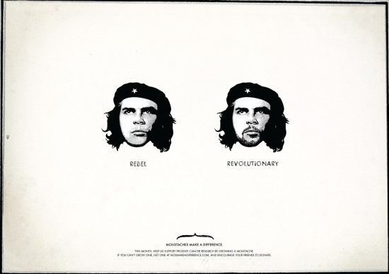
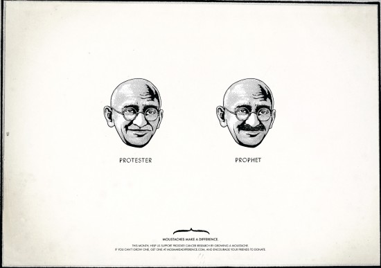
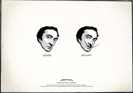
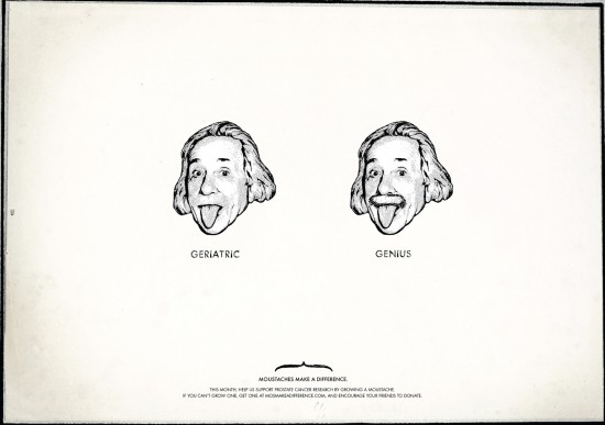
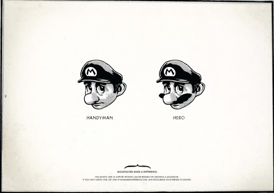
A beautiful ad campaign by TBWA Singapore "Moustaches Make A Difference." An initiative to show its support for research against prostate cancer. Many examples in the sequel to Super Mario, Einstein Gandhi.
Thursday, September 1, 2011
A Woman Made of Candles


Little bit creepy but quite amazing. This wax woman embedded with candle wicks was made by A.F.Vandevorst.
Wednesday, August 31, 2011
Typographic Transit Maps


Show your love for the Bay Area and its transit system with this typographic map. The text on the poster is the names of the stops along each line.
Only $25.00, buy it here.


Friday, July 1, 2011
‘MORE IS MORE’ BY TYPOGRAPHER ALEX TROCHUT


There are few people as talented as Alex Trochut when it comes to typography design. Most of the time his type is completely experimental, flowing like liquid gold or seemingly made up of random sticks.
via the fox is black.
Monday, February 14, 2011
Valentines hearts by Marian Bantjes


Friday, February 26, 2010
Rebranding the Swedish Armed Forces


 A project group of Hyper Island – Robbin Ingvarsson, Fredrik Holmberg, Kristina Herngren, Anke Buchta, Simon Schlüter and Waldemar Wegelin- rebranded the Swedish Armed Forces. They turned the usual function of camouflage around and used one of the basic shapes of geometry, the triangle, to create a new type of camouflage that is all about showing yourself. The goal is to reflect the diversity with the Armed Forces.
The focus for Swedish Army is peacekeeping abroad. In order to fulfill their missions they want to attract new talent – brain rather than muscles.
The challenge of the re-brand was to change the Swedish Armed Forces from a traditional defensive institute into a modern employer. {via}
Subscribe to:
Posts (Atom)